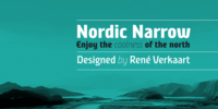
The original spark for Nordic Narrow came to designer René Verkaart one day while drinking a glass of “Apfelschlore” (a carbonated water and apple juice mix). On the bottle logo he saw an intriguing “a”, and he started to sketch on a new typeface.
Though this single glyph served as an inspiration, the end result was something quite different.
One of the trademarks of the typeface is the diagonal mid strokes. A reference to the nordic runes, which he studied during the design process.
More…
Nessun commento:
Posta un commento