A super-stylized retro display face for headlines, posters, drop caps and other basic-but-oversized uses.
A super-stylized retro display face for headlines, posters, drop caps and other basic-but-oversized uses.
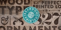
Brandon Printed is based on the famous Brandon Grotesque typeface. It has an eroded, printed look with four variations of every letter. With several different styles like a shadowed version, an inline version and a double printed version you can create a lot of lovely combinations.
The Brandon Printed package also contains a set with 95 Extras like arrows, catchwords, stars, emblems numbers & lines.
The Glober font family includes 18 weights - nine uprights with nine italics. It is characterized by excellent legibility in both - web & print design areas, well-finished geometric designs, optimized kerning, excellent web-font performance and legibility etc.
Inspired by the classic grotesque typefaces - Glober has his own unique style in expressed perfect softened geometric forms.
More…
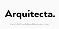
Arquitecta. The humanist typography as a rational project.
Since the experimentation from the Bauhaus through modern sans history we looked for a new mix to construct a rational geometric typeface with humanist proportions suitable for text layout and continuous reading.
Inspired by American & European hand lettering from the first half of the past century, Arquitecta finds his own space as a great alternative for paragraphs in front of classics like Futura, Kabel or Avant Garde.
More…
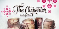
The Carpenter is an elegant and versatile connected script family of three weights. The Carpenter also has a set of ornaments, patterns and pictograms designed to support the script font. The Carpenter has plenty of OpenType features: To activate the alternates click on Swash, Contextual, Stylistic or Titling Alternates or Lining Figures in any OpenType Savvy program or manually choose from even more alternate characters from Glyph Palette.
The Carpenter is an effective and easy to use font for creating ambitious headlines, logos & posters with a custom-made feeling.
The Carpenter is loosely based on Fenotypes earlier release Mercury Script.
For the best price purchase the complete The Carpenter Family.
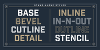
Industry Inc is a collection of type based on the bold uppercase style of the Industry family. The typeface comprises numerous stand-alone styles along with a layered type system. Think of it as a toolbox equipping designers with extensive typographic options and combinations.
What will you make?
Want to know more? Look through the manual or watch a video tutorial on layering.
Note: The Stencil and Cutline styles are not meant to be layered.

Lumina combines a fluid, informal look with an upright, fairly formal character structure. The font is reminiscent of leaded or stained glass, suggesting a trying to-be-solid outline with flowing inner spaces.
Characters are softened by the use of staggered heights and slightly irregular widths, creating the impression of hand-crafted, ink-drawn shapes. More…
The outline has been given an irregular, slightly hand-crafted look that is at variance with its modern character and hints at both the informality of a grunge font and the carefully hand-drawn quality of medieval illuminated scripts (hence its name).
It is one of the few informal, compressed fonts that retains a high degree of legibility. Use it when you want your text to be both relaxed and readable, and yet take up very little space on the page.
Oksana Text is the demure version of Oksana, with shorted serifs, higher contrast, more slender proportions.
In six weights from Thin to Black and with the real italic, this typeface is suitable for longer text with rich typography.

I know what you're thinking: Where can I find a Lycian font that looks good and is easy to use? Look no further! This font has the Lycian characters both in their unicode positions, and where you can find them on the keyboard.
The glyphs in this font were based on those on a Kerei monument in Lycia.
I am not an archaeologist, so your feedback would be most welcome.

Edda Pro is another art nouveau revival by German type designer Ralph M. Unger.
Edda Pro is based on Edda, designed in 1900 by Heinrich Heinz Heune for Schelter & Giesecke, Leipzig, Germany.
Unger redesigned the beautiful forms, completed and expanded this outline caps-only typeface for the profonts library. Also, he added a nice collection of very useful frames and ornaments in EPS format supplied with the OTF version of Edda Pro.
Edda Pro can be used for anything in advertising, signmaking, posters, restaurants, hairdressing, paint, wallpaper and so on.

Goldburg is based on the lettering found on Idaho historical Markers. The lettering was designed by George Bowditch, in the late 1950s based on unknown historical sources.

Fractal is a font whose Hausdorff-Besicovitch dimension is greater than its typographic dimension. Big is better. To be used at display sizes larger than 200pts.
Prince is an embellished Typeface with very fine loops and very pointed serifs based on Bodonian forms.
You get two fonts for the price of one, one embellished font and the second one with less embellishments to mix.
This is another unusual typeface with a royal touch by your designer of elegant fonts Gert Wiescher
During a visit to Seville, Rick was very struck by the local tradition of street names made from tiles: from sketches and doodles made in 36°C, he and David produced a font with tiles formal and informal, dancing text and standing text - a family of four fonts for the price of one.
The tiles work as drop capitals to the dancing and standing texts, which also have their own normal caps.

DSType proudly presents Diversa Std, the same system as Diversa, but with separate styles: Serif, Serif Stencil, Inline, Soft Serif, Sans, Sans Stencil, Slab, Slab Stencil and Baroque.
Diversa Std: Because uniformity still sucks!

Cayenne is a all caps hand-lettered font in three weights, two dotted versions and an outline and an inline font.
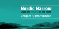
The original spark for Nordic Narrow came to designer René Verkaart one day while drinking a glass of “Apfelschlore” (a carbonated water and apple juice mix). On the bottle logo he saw an intriguing “a”, and he started to sketch on a new typeface.
Though this single glyph served as an inspiration, the end result was something quite different.
One of the trademarks of the typeface is the diagonal mid strokes. A reference to the nordic runes, which he studied during the design process.
More…
I think it is one of our most useful fonts in that it doesn't draw much attention to itself while it is quite refreshingly different.
Almost all shapes in Vecta are rounded to provide a friendly effect.
Proportions are somewhat condensed providing economic space usage.
Vecta looks equally at home in headlines as well as body text.

Soft and round are the words that best describe the Co font family. Its underlying geometry structures the font design and allows it to have an even rhythm. Co Arabic carries through all the design elements that give the Co family its look and feel into a truly fresh Arabic script.
Dalton Maag has engineered the font to its usual high standards and listened carefully to Arabic experts and readers to create a superbly readable font.
The Co font family was created in collaboration with North Design.
The family is also available in a Standard Edition, which includes the Latin Extended A character set, and the Corporate Edition which includes full Latin, Greek and Cyrillic character sets.

A legible sans serif, with bouncy edges. A little loose but not too jumpy!
Comes with a fi and fl ligature.

Ebisu is a sans serif family consisting of 10 different weights.
Designed by Alex Haigh in 2010, and influenced by one of his original designs from 2008 - Hiruko - Ebisu loses the soft sans serif curves, for a more robust geometric styling.
More…
The kerning has been individually crafted for each letter, with vigorous attention - to ensure that each letter from is produced in a way that works with every member of the set, for a tightly knit sans serif family.
The open type features have an extended character set to support Central, Eastern, and Western European languages. With each weight conveying a different personality, Ebisu is set to become the modern new sans serif family to sit alongside you classics for versatility, cleanliness and a crafted edge.

Goma Mono is a display monospaced rounded sans serif font built in ten styles. This family, with five weights, covers a wide variety of character due to the large difference in thickness.
The typeface can be used perfectly in display sizes and logos, but is also suitable for small texts.
Goma Mono is released with 414 glyphs and includes Open Type features.

During a visit to London in 2008 I fell in love with the square font used on the British car number plates. I was immediately inspired to start working on this font and have been developing it intermittently ever since.
Several more trips to London and the project evolved before it finally took off and became Shentox. Despite the starting point being inspired by simple, everyday car plates, the font soon evolved into something fine and very rich in detail.
Even though the square genre is very restrictive, Shentox is a highly legible contemporary font with a full range of weights, useable not only as a display family for headlines and posters, but as a distinct, clean font family for branding and general editorial use (Especially magazines).
It has been carefully drawn paying extra attention to the details, high end finishes that makes Shentox a safe font for use in large scale work. For example, the curves of every individual corner have been adjusted character by character to avoid the common problems encountered with square fonts (Eg.
darker corners between weights or a visually inconsistent radius between the Upper and Lowercases as a result of copy/paste). Shentox italic, which has a 12 degree slant, has been corrected to avoid distortion when slanted.
The radius of the upper-right and lower-left corners are more pronounced, giving it a more fluid Italic feel. Shentox is available in Open Type format and includes ligatures, tabular figures, fractions, numerators, denominators, superiors and inferiors.
It supports Central and Eastern European languages. This type family consists of 14 styles, 7 weights (Thin, UltraLight, Light, Regular, Medium, SemiBold and Bold) plus italics.

This font owes its inspiration to the Bauhaus, the celebrated 1920s design collective which more or less invented modernism as we know it in the applied arts: from architecture and industrial design to graphics and typography.
In its day, Bauhaus typography would have been considered brutally modern. Nowadays, when unadorned sans serifs are commonplace, it still has a freshness and quirkiness that sets it apart.
With this new release I've tried to recapture the zeitgeist of those pioneering days.
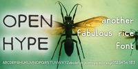
Saying a message with a stright font can be redundant. All day long, after all, all we write is Arial or Helvetica (and they're great). But sometimes, straight angles and perfectly geometrical letters just don't work.
Open Hype comes to the rescue in these moments, with a full range of very readable upper and lowercase characters, and numbers. Titles, headlines, headers, logos, book covers, stickers, this font is appropriate for almost any use, and will leave a mark with its unique identity and its extreme readability!

The most relevant characteristic of this typeface exhibits a compact and regular shape slightly condensed and fluently connected. Its glyphs are emulating the look of handwritten characters with ink.
Their exuberant graphic strokes with sharp edges maintain the influences of printed types produced by mechanical process.
Unlike most of the italic type of today, the capital letters are as high as the ascending lower-case.
The brush script style (Originally designed in 1942 by Robert E. Smith for the ATF) inspired many contemporary and beautiful typefaces like Wisdom Script, Mission Script, Marketing Script, Motion Picture, Thirsty Script, Lobster, Lauren Script, Deftone Stylus and many others.
More…
Old style figures, discretional and standard ligatures, case sensitive and a set of tails and ornaments.