
martedì 31 dicembre 2013
lunedì 30 dicembre 2013

joeHand 1 Font Download

JoeHand was one of the first scripts by JOEBOB graphics.
A complete character set with numbers and most (but not all) special signs.
Madelinette Font Download

Simple. Classic. The beautiful handwriting of your mother. Madelinette is inspired by Palmer Method which was introduced to the US in 1894 as a modern alternative to Spencerian. The method won many awards including the Gold Medals at the Panama Pacific Expo of 1915 and the Sesquicentennial Expo in 1926.
This disciplined style set the standard of cursive penmanship for decades of American schoolchildren.
Of course, Madelinette was written with a steel nibbed dip pen in black ink…she’s traditional.
She looks perfect in grandmother’s pearls & sweater sets. Travels Europe on holiday. Loves Parisian food. Owns a tweed suit, plaid capris, a single pair of jeans and more shoes than she can count.
More…
Snemand Font Download

Snemand, in Danish, means Snowman. Quite appropriate for the last month of the year! The font is all caps, but upper and lower case letters can be interchanged and it includes alternates for all lower case letters.
Snemand is a very legible font and has that great ‘unevenish’ look - making it a great typeface for packaging and books.
Enjoy the snow - while it lasts and go out. You might even build a Snemand!
Sandscript BTN Font Download
Sandscript comes from the hand of the Original Copywriter.
Use this smart typeface with characteristic descenders to set long lines of clean, organized-looking text and maintain a personal touch.
Or use it to mark up grammatical and spelling errors whenever you wish to critique with authority.
FW-Leaves Font Download
A typeface that allows the direct typing of headers and footers in WP packages. Full frames can be made using any drawing packages clone, flip and rotate commands. The typeface is supplied with two weights which will allow countless numbers of frames to be created.
As the name suggests the frames and headers/footers all have a leaf theme.
domenica 29 dicembre 2013
Stronghold BB Font Download
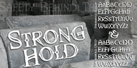
Fill the moat and sharpen your spears! It’s time to defend the keep against orcs!
Comes with Regular and Deco and has a large complement of European characters.
Standard Poster Font Download
Designed at Polygraphmash type design bureau in 1986. Based on “English” bold styles of the Ossip Lehmann type foundry (St.-Petersburg), of mid-19th century. The digital version was developed at ParaType in 1992 by Vladimir Yefimov.
For use in advertising and display typography.
Klin JY Font Download
Jure Stojan first created JY Klin for a student magazine in Ljubljana, Slovenia. ‘It was borne out of my frustration with layout [programs] and their taste for messing with decent fonts (making the headline occupy the entire column width at any cost, for instance).
Therefore, I designed a “heavy duty” display font—it can be extended up to 120 per cent without any loss in quality (it is fairly condensed, so no one could think of squeezing it any further).
I even used the font, stretched by the very 120 per cent, for 10 point text and the result was surprisingly legible (given some peculiar details prominent at display size).’
Kaeding Braille Font Download
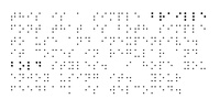
When I needed a Braille font for a project, it was hard to find one that worked the way I wanted. When I type an ‘A’, I want the dot pattern for an ‘A’. Fonts from the big computer companies have their Braille hidden deep in the unicode and are not easy to use.
This new font is very simple, and the dot patterns are matched to the keys on the keyboard. Simply type; no more hunting through unicode pages. If you develop materials for the sight-impaired, check out my Moon Type font also.
Invocation AOE Font Download
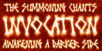
Made from a simple font incantation, the Invocation typeface was born. Inspired by an old Atari game called Necromancer where trees uprooted and came after the wizard, or something like that. The end result, a thematic typeface spawning roots.
“On darkened night, the moon eclipsed, a cryptic verse does pass my lips, from ancient parchment, edges worn, this Invoctation font is born...”
Sometimes we need an evil look for our designs, so why not summon this typeface into your hands today!
Nutnik Font Download

Nutnik was made using cut out cardboard letters, black paint and some brushes. The result is a highly legible, yet grungy font. It comes with all the diacritics you could possibly wish for and stylistic alternates for the lower case letters.
Schwandner Black Fleurons Font Download

Highly intricate ornaments inspired from the work of Johann Georg Schwandner (1716- 1791). Complete your collection with Schwandner Versalia and Schwandner Ornaments.
Dexterous Font Download
Dexterous is my interpretation of an antique typeface.
The font includes upper and lowercase alphabets with alternate “E F L M S T” characters and alternate “c e m s” characters, numbers, punctuation, accented characters, symbols, and miscellaneous characters.
Pupcat Font Download

Pupcat was inspired by posters from 1960s Hollywood comedies. It’s cute, thin and lives for fun. Dig the OpenType features: an alternate A, E and R, fractions, ordinals & math symbols.

sabato 28 dicembre 2013
Hub Font Download
Designed by Gennady Fridman and released by ParaType in 2008.
Hub represents so called block letter handwriting style, which becomes more and more usual and nowadays replaces traditional cursive handwriting.
One of the reasons for these changes is an often requirement in official forms to write in block letters. Some forms contain even stricter rule – to write in capital letters. Hub was designed to meet these requirements and includes small caps instead of lower case letters.
More…

Liberty Font Download
Based on Lucien Bernhard’s idiosyncratic Schoenschrift, Liberty was designed for ATF two years later, in 1927, by W.T. Sniffin.
Pendulum Font Download
Pendulum is the much-anticipated digitization and swashy expansion of Americana, an amazing yet long overlooked treasure from the Nebiolo foundry, circa 1945.
With heavy descenders and seemingly floating ascenders emanating from one of the most classical attempts at connected upright calligraphy, never did a font have this much charm and complexity at once.
More…
Plenty of alternates and extra custom endings are included for extra choice and variety.
One click of a button and you have a nice swash ending for your word, or a nice mix of swash lowercase for a calligraphic plate.
Its use can efficiently vary from simple slogans to richer layouts such as music sleeves or movie posters, and everything in between.
Grit Primer Font Download
Grit Primer is a distressed, aged typeface resurrected from letterpress samples of schoolhouse primers common in the midwest around the turn of the century. Additional characters are also included in this expansive offering.
Grit Primer offers the charm of handset type as well as slightly offset baseline characteristics and a rough-hewn character easily visible at larger point sizes, hence the name.
Lysosome Font Download
Lysosome, was created and designed by Noah Rothschild. It is a unique typeface that is offered at a great price! Lysosome is a cute, curved and delightful font. Some think it’s bubbly, others think it"s just enjoyable to read.
Lysosome adds a unique element to any document. In addition, Victory Type has thrown in Lysosome-Outline for free. Both fonts are complete with a full character set, including European glyphs for your enjoyment.
Syndrome BRK Pro Font Download

I just loved the design idea behind this font, but the original font had a lot of ugly artifacts - so I have completely redrawn ALL the letters, before expanding the character set.
The lowercase has been redrawn with a higher x-height, making the font even more usable (with more “normal” word shapes).
More…
They also contain all glyphs in the Latin Extended-A Unicode block (which among others cover the Central European and Baltic areas) supporting: Afrikaans, Belarusian (Lacinka), Bosnian, Catalan, Chichewa, Croatian, Czech, Dutch, Esperanto, Greenlandic, Hungarian, Kashubian, Kurdish (Kurmanji), Latvian, Lithuanian, Maltese, Maori, Polish, Saami (Inari), Saami (North), Serbian (latin), Slovak(ian), Slovene, Sorbian (Lower), Sorbian (Upper), Turkish and Turkmen.
And they of course contain all the usual “western” glyphs supporting: Albanian, Basque, Breton, Chamorro, Danish, Estonian, Faroese, Finnish, French, Frisian, Galican, German, Icelandic, Indonesian, Irish (Gaelic), Italian, Northern Sotho, Norwegian, Occitan, Portuguese, Rhaeto-Romance, Sami (Lule), Sami (South), Scots (Gaelic), Spanish, Swedish, Tswana, Walloon and Yapese.
FG Rochelle Font Download
FG Rochelle has some special capitals like the B and R that makes it stand out from other script fonts.
A beauty!
Quahog BB Font Download

QUAHOG BB is a Rhode Island original, inspired by classic American Italic designs. The font family comes with Regular, Italic, Bold and BoldItalic. The opentype version has auto-ligatures for fl, ff, fi, ft, st.
Oakland Font Download

Oakland is a Streamline era design inspired by some hand-drawn lettering on a 1930’s French poster advertising a certain brand of Car (Automobile for our American cousins). It’s ideal for giving poster and design work that late 1930s to mid 1950s feel.
Make a bold statement with this all capitals typeface!
venerdì 27 dicembre 2013
Cattle Drive JNL Font Download

Cattle Drive JNL is based on some examples of a classic condensed wood type. Lettering of this period lends itself well to themes of Western life, carnivals, circuses or classic broadside posters.

Mulsanne Font Download
Inspired by the lettering used on race cars this three-dimensional design has four individually drawn outlines to create multiple solutions with layers and filters. Mulsanne requires subjective display kerning and compensation.
The following sample illustrates the layered outlines:

Hanyi Bai Qi Font Download
This font is intended for use with simplified Chinese. It contains the GB2312 character set.
RM Serif Font Download

A modern classic which will readily find a place in your font folder. Great effort has been taken to ensure the balance of color and weight for every glyph to promote flowing legibility.
Due to the modular nature of this design there may be a slight lack of smoothness to the curves at very large point sizes (around 100 pt and above).
Liquorice Twist Font Download

Liquorice Twist is a light-hearted fun font which developed from some hand drawn text designed to accompany and be integrated with some ‘Zen Doodling’ art that someone had drawn. It is very informal and unconventional, with the glyphs created using unusual and loose ‘rules’.
The font has a set of stylistic alternates with equal height lower-case letters.
It also has the option of alternate initial capitals and alternate ending lower case letters accessible via contextual alternates.
I hope you will enjoy using it and if you have any further requirements please don't hesitate to contact me.
More…
Foros™ Font Download

Foros(tm) is a modern humanist sanserif font family of 8 styles. Each style contains beside many other alternatives of upper and lowercase letters a ‘unicase’ character set. Foros is a development of a modern pattern of rough geometric shapes in combination with open humanistic forms that produces a mixture of obstinacy and delicacy.
Quadratic shapes of ovals bring stability and firmness, but angular terminals of diagonals in several letters together with curved junctions of bowls with verticals stems add emotions and elegance.
Such variety in image make it possible to use the fonts in different kinds of display typography. Foros type family was designed by Oleg Karpinsky. Released by ParaType in 2013.
Sigmund Freud Typeface Font Download

“For those who regret what keyboards and touch screens have done to their penmanship, typographer Harald Geisler has an answer: Sigmund Freud.”
— The Wall Street Journal
Sigmund Freud was a neurologist who lived from 1856 to 1939.
His research and studies led to the foundation of ‘Psychoanalysis’.
When I first saw Freud’s century old letters, I was fascinated by the beauty of these historic manuscripts.
It made me smile to imagine a person writing his or her shrink a letter set in Freud’s handwriting. I started to plan creating a font based on his manuscripts. More…
To start the creation I selected eight handwritten documents from the archive in Vienna – This selection of specimen was my orientation during the design process. The Samples were created between 1883 to 1938 and are of various character such as handwritten scientific papers, personal letters, notes and a telegram.
After a year of preparation and design work, I finished four alphabets based on Freud’s handwriting.
What are the different Versions PRO, Kurrent, #1, #2, #3 and #4 about?
When you write a text on your computer every letter looks exactly the same. In order to make type look like handwriting, I chose four different variations of each letter from Freud’s manuscripts, drew and stored them in the font.
The font is then programmed to exchange letters while you are typing. This makes the rendered result on your screen or print look like unique handwriting.
Through this mechanism never the same two o’s will stand next to each other. With every touch a unique look is generated. This works in certain applications i.e. Word 2010(or newer), Pages, TextEdit, Editor(Pre-installed on Windows 7 or newer), InDesign, Illustrator… →Here you can see an animation of what this effect looks like in action.
Date: December 2013)
Until the 1950′s a different handwriting was taught throughout German speaking countries (Switzerland, Austria, Germany). This style is called Kurrent. The name Kurrent and Cursive derive from the Latin word currere - to run, hurry - both styles were designed to write fast.
As you can see in the samples above, Freud practiced both Kurrent and when writing english Cursive (Latin script or Joined-up). Kurrent has three significantly different letters (s,h,e). Use Kurrent to render the authentic look of an historic Sigmund Freud letter in German.
International Typeface
Usage recommendations
Point Size — To reproduce the size of Sigmund Freud’s handwriting adjust the type size between 18-24 point in your word processor. If you are using an imaging software like Photoshop set the resolution to 300dpi and adjust the point size between 18-24.
Line Spacing — Narrow the line hight until swashes of capital letters touch the baseline above. This also happens when you write a letter and gives the document a unique handwritten look.
Right Aligned — Freud had the habit to write towards the right edge of the page and start loosely on the left. Set your text alignment to ‘right’ to incorporate this dramatic expression also to your documents.
What do other People say about the Sigmund Freud Typeface?
Credits
Thank you. All of Freud’s Manuscripts shown are © Sigmund Freud Museum Vienna. Poster Image: IN17 - Sigmund Freud, Germany 1932. © Freud Museum London. Flag Image: IN19 - Sigmund Freud 1930’s.
© Freud Museum London.
AT Brushure Font Download

AT Brushure is a brush, scrpit font with handwritten touch.
Even legible at 12 pt, these interesting and distinguishable glyph shapes will give you a wide range of design possibilities.
Radiac Font Download

Radiac is a semi-monospaced unicase design inspired by lettering constructed from pieces of tile.
Swallowtail Butterflies Font Download

Okaycat Font Foundry proudly presents “Swallowtail Butterflies”! An excellent illustrated picture font containing so many pretty butterflies.
Vtg Stencil US No.4 Font Download

The Vtg Stencil fonts from astype are based on real world stencils. The US No. 4 design was derived from a typical antique American stencil-plate. This revolving stencil-plate was invented by Eugene L.
Tarbox and patented in 1868. It was a mass produced product and a very common tool in the United States.
In case of US No. 4 an original early plate from New York Stencil Works was used.
The Regular font style is a clean font design featuring a full standard Type1 glyph set including some typical stencil ornaments and tabular figures. The Paint font style is made from true stenciled letters and features all the letters of the stencil-plate only.
Gradl Initialen ML Font Download
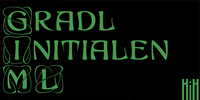
Max Joseph Gradl designed Art Nouveau jewelry in Germany. At least some of his designs were produced by Theodor Fahrner of Pforzheim, Germany -- one of the leading manufacturers of fine art jewelry on the Continent from 1855 to 1979.
I don't know if he designed for Fahrner exclusively, but every example I found was produced by that firm. I assume it was also the same M.J, who edited a book, Authentic Art Nouveau Stained Glass which was reissued by Dover and is still available.
More…
They exhibit a sculptural quality as if they were modeled in clay (or gold) rather than drawn on paper. His monograms, especially, reflect that quality. Those shown in plates 112 through 116 in Petzendorfer actually appear to have been designed specifically for fabricating in the form of gold or silver pendents.
Of the initial letters that came out of Germany during this period, these by Gradl seem unusually open and lyrical. They seem to be dancing on the page, rather than sitting. Please note that Gradl designed only the decorated initials.
All other characters supplied were extrapolated by HiH, including the accented initials. Orn.1 (unicode E004) is based on a jeweled gold clasp designed by Gradl (please check out Gallery Image on Myfonts.com).
Also included are an art nouveau girl’s face, a swan and the face from Munch’s “Scream”, from scans of old printer’s ornaments.
Added glyphs for the 1250 Central Europe, the 1252 Turkish and the 1257 Baltic Code Pages. Added glyphs to complete standard 1252 Western Europe Code Page. Special glyphs relocated and assigned Unicode codepoints, some in Private Use area.
Total of 341 glyphs. Both upper & lower case provided with appropriate accents.
Revised vertical metrics for improved cross-platform line spacing.
Four Ornaments: face1, face2, swan and orn1 (silhouette of Gradl clasp)
Use whichever works best for your applications.
Kanban Font Download
Kanban is the work of British designer Ed Bugg, an all capital, oriental style typeface. Kanban was the word used for shop signs in old Japan and the letter forms mimic the square look of Japanese and Chinese calligraphy.
Kanban is the ideal display solution wherever an oriental appearance is needed.
Sweet Square Font Download

The Engraver’s Square Gothic—like its rounder cousin, the engraver’s sans serif, Sweet® Sans,has been one of the more widely used stationer’s lettering styles since about 1900. Its minimal forms, made without curves, were popularized long ago by bankers and others seeking a serious, established feel to their stationery.
One might argue that the design is a possible precursor to Morris Fuller Benton’s Bank Gothic® typeface. More…
This demanding technique is rare today given that most engravers now use a photographic process to make plates, where just about any font will do. But the lettering styles engravers popularized during the first half of the twentieth century remain both familiar and appealing.
The sources offered just uppercase, small caps, and figures, yet similar, condensed examples had a lowercase, making it possible to interpret a full character set for Sweet Square. Italics were also added to give the family greater versatility.
Its unique style is as useful as it is novel.
Iscriviti a:
Post (Atom)