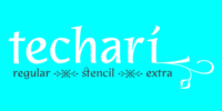
Techarí comes from a commission in which the brief consisted of the creation of a typeface family to be used for the design of the third disc of the band called Ojos de Brujo based in Barcelona.
This disc was called Techarí, which means “free” in Caló, the language of the Spanish gypsies. More…
Techarí is a mixture of lots of influences, which give it its unique personality.
From its technical viewpoint designing Techarí was a challenge, on the one hand it had to have lots of personality, and on the other it had to work in text at 9 or 10 pt size.
Its goal is precisely that, while keeping a strong personality it works in text size.
The way it has been “cut" is unconventional, it has been carefully done to keep the freshness of the typeface by taking advantage of the letterforms' flow. Techarí extra complements the typeface by taking a classical typographic form, the ornament, and making it a contemporary graphic tool, vindicating this wonderful typographic element.
Nessun commento:
Posta un commento