Visualizzazione post con etichetta Tuscan. Mostra tutti i post

sabato 18 gennaio 2014

Antique Tuscan No 9 Font Download

Antique Tuscan No.9 was one of the earlier wood-type designs by William Hamilton Page. It was first shown among the specimens produced in 1859, shortly after Page entered into a new partnership with Samuel Mowry, owner of the Mowry Axle Company.

The new company was named Page and Company and was located at the Mowry facility in the Greenville section of Norwich, Connecticut. More…

Antique Tuscan No.9 is an extra-condensed version of the tuscan style that had been released in moveable type by Vincent Figgins of London in 1817 and had become so popular for advertising in the intervening years.

Because of the extreme compression in the design, we might be tempted to describe it as "Triple-X," but that might be misleading. The analogy would, of course, be to clothing sizes, not movie ratings.

Because of the compression, this typeface reads best when set extra-extra-extra large. For printing, we recommend 36 points or larger. For the screen, we suggest at least 72 points. An unusual and distinctive design, it is best used with discretion.

If I were doing a term paper for school or submitting an article to a magazine for publication, I might use it for the title page, to grab someone’s attention. I would certainly not use it for the main body of text - not if I expected anyone to read what I wrote.

If you wonder why we make this recommendation, take the Ten-Point challenge. Print this paragraph using Antique Tuscan No.9 and set the font size at 10 points. If you are young and blessed with good eyesight, you will probably be able to read it - with effort.

So, here is the challenge: hand it to your Grandmother and ask HER to read it.

read more

lunedì 16 dicembre 2013

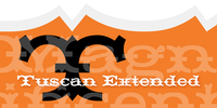
HWT Tuscan Extended Font Download

HWT Tuscan Extended

Tuscan wood types cover a fairly wide range of styles, and there is sometimes confusion over what is classified as a Gothic Tuscan and what is considered an Antique Tuscan. HWT American Chromatic and P22 Tuscan Expanded are more precisely faces of the Antique Tuscan variety.

Gothic Tuscans are generally absent of the heavy serifs typically associated with their Antique Tuscan brethren (although decorative bifurcation of terminals can imply serifs). Additional internal decoration with spikes along the stems gives some Tuscans their distinctive look‹, these faces are often described as “Circus Types.” More…

Tuscan Extended is an extremely wide design, with a distinctive slab crossbar running through the center of most characters.

Each letter is a complex system in its own right‹. This typeface is best used very large in short headline work. The style defies falling clearly into either the Antique Tuscan or Gothic Tuscan category.

The new HWT version of Tuscan Extended has been meticulously redrawn by Frank Grießhammer.

During production, he also incorporated a number of new letterforms, bringing the font to over 300 characters (including a full ASCII character set and Central European accented characters).

read more

sabato 26 ottobre 2013

Gringo Tuscan Font Download

Gringo is a type family that contains 27 different varieties. It is divided into three groups: Sans, Slab, and Tuscan = Europe - Texas.

Due to its consistant structure, the single groups can be mixed as you wish.

Furthermore every variety comes in Light, Medium, and Bold.

There are three widths, from Narrow to Wide. Additionally, there is also a Dingbats font. The concept of Gringo is a fusion and a merging of type cultures to cross borders and create something new.

More…

Gringo won 3rd place in the “tdc2 2006 award” by the Type Directors Club New York.

read more

martedì 24 settembre 2013

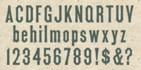
MPI Tuscan Extra Condensed Font Download

MPI Tuscan Extra Condensed

Tuscan X Condensed (whose actual name is Gothic Concave Tuscan Extra Condensed) was first produced in wood type by William H. Page & Company around 1872. The design is derived from a Gothic Condensed typeface, but with vertical stokes bowing inwards at the center.

We modified the weight of the uppercase characters (since the original wood type has a lowercase much thinner than the caps) to harmonize with the lowercase when used digitally.

read more