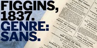
The first sans serif types were made in London in the early 19th century. They were severely modern, all caps and bold.
The Figgins foundry, inventor of the term sans serif, showed a fine example in its specimen of 1836.
The extra bold weight of Figgins Sans is a close revival of the original, with the addition of a lower case which retains its partly geometric, partly grotesque quality. The family is rounded out with other weights and an italic, and extended into Cyrillic and Greek, all executed in what is assumed to be as authentic a manner as possible, given the hypothetical nature of the exercise.
More…
Nessun commento:
Posta un commento