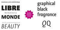
The design of the type family ›libre‹ started as an University project under the auspices of Prof Lu(as) de Groot in Potsdam. It was enlarged step by step in typographical features and internationalisation.
The qualities are visible in a wide range of font weights as the specially drawn italic suggest. The weights are carefully drawn so that the thinnest is powerful like a poster type and the thickest is as elegant as an airy script.
The family is usable in the whole of Europe, because of the Cyrillic and Greek character sets (JHA LibrePro).
Nessun commento:
Posta un commento